Python Matplotlib
The graphical representation of data is plotting. Plotting is one of the most important visual tools for evaluating and understanding scientific data and theoretical predictions.
The most developed and widely used plotting package for Python is matplotlib. It is free open source and was created by John D. Hunter.
https://matplotlib.org/stable/tutorials/index
If you have Python and PIP already installed on a system, the installation of Matplotlib is very easy.
Install it using this command:
C:\Users\Your Name>pip install matplotlib
If this command fails, then use a python distribution that already has Matplotlib installed, like Anaconda, Spyder etc., or online Python editors: such as replit
Since Matplotlib is an external library, it must be imported. It has to be used with NumPy together. Therefore, we have to import both if we
want to produce 2D plots.
import numpy as np
import matplotlib.pyplot as plt
Now the Pyplot package can be referred to as plt.
https://www.w3schools.com/python/matplotlib_getting_started.asp
Introduction to Pyplot
Most of the Matplotlib utilities lies under the pyplot library, and are usually imported under the plt as the prefix.
import matplotlib.pyplot as plt
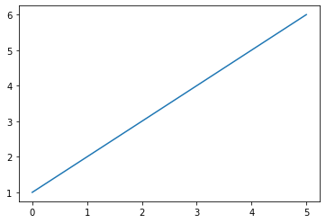
plt.plot([1, 2, 3, 4, 5, 6])
plt.show()
If you provide a single list or array to plot, matplotlib assumes it is a sequence of y values,
and automatically generates the x values for you.
That's why the x-axis ranges from 0-5 and the y-axis from 1-6.
Since Python ranges start with 0, the default x vector has the same length as y but starts with 0.
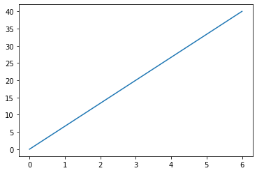
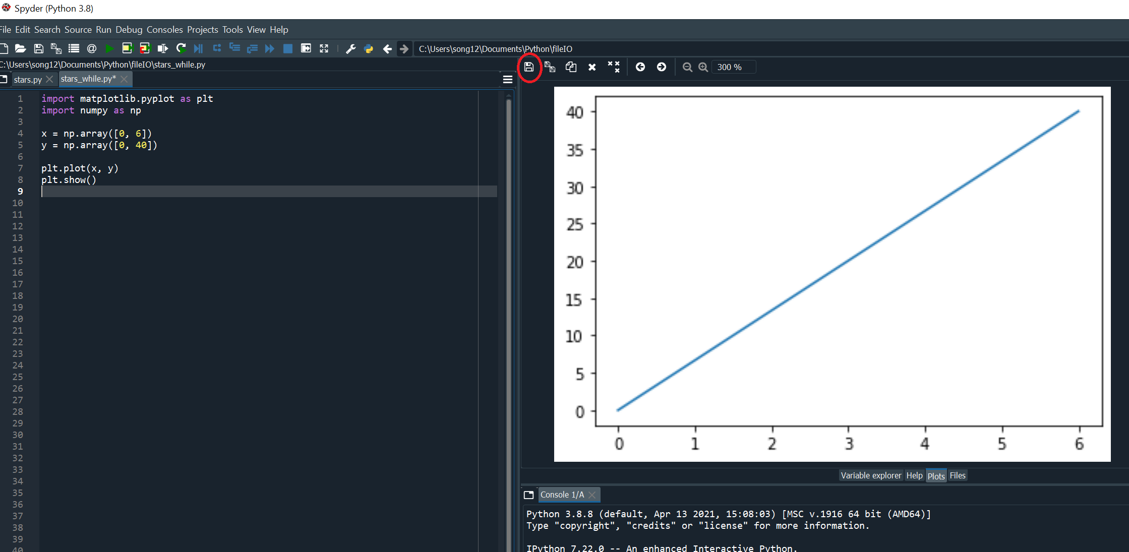
To plot x versus y, you can write:
import matplotlib.pyplot as plt
import numpy as np

x = np.array([0, 6])
y = np.array([0, 40])

plt.plot(x, y)
plt.show()
plt.show() should display an interactive window.
If you are working in Anaconda Spyder IDE, you might see "Figures now render in the Plots pane by default.
To make them also appear inline in the Console, uncheck "Mute Inline Plotting" under the Plots pane options menu.
The plot() function is used to plot x-y data sets where x and y are arrays (or lists) that have the same size.
Save plot as images
The operations of plot image saving are similar. We will show you how to save plots on replit and Anaconda Spyder.
1. To save images on replit
Click on the floppy disk icon and save the image into the current Python project.
If the floppy disk icon is not visible, make sure to resize the console window, so the plot figure is fully displayed.
Once the image is saved in the same project, it will show
up under the main.py in the file listing. You can click on it to download it.
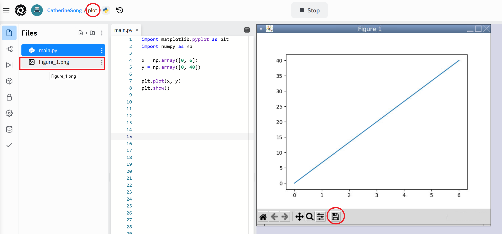
2. To save images on Python Spyder is the same. Find the floppy disk icon and save it to the desired folder.
https://matplotlib.org/stable/tutorials/introductory/pyplot.html
https://www.w3schools.com/python/matplotlib_intro.asp
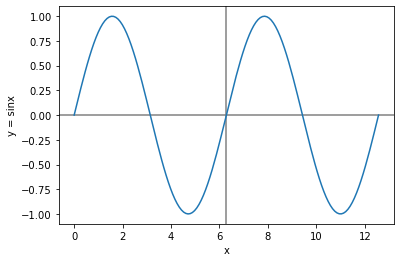
Simple 2D x-y plots
We are going to plot the sine function over the interval from 0 to 4pi.
The main plotting function plot in MatPlotLib does not plot functions, it plots (x,y) data points.
To create the wavey smooth sine function, we need to create enough (x,y) data points so that when plot draws straight lines between the data points,
the function appears to be smooth.
import numpy as np	           # import the NumPy module
import matplotlib.pyplot as plt    # import the MatPlotLib module

# create the x data arrays (140 data points are more smoothier than 40 points, try to replace 140 with 40 points to see the difference)
x = np.linspace(0, 4.*np.pi, 140)
y = np.sin(x)                      # create the y data arrays
plt.plot(x, y)                     # plot draw straight lines between the (x,y) data points

plt.xlabel('x')	         	   # xlabel(string) takes a string argument that specifies the label for the graph's x-axis
plt.ylabel('y = sinx')             # ylabel(string) takes a string argument that specifies the label for the graph's y-axis

# draws a horizontal line across the width of the plot at y=0. The default colour is black. zorder=-1, the horizontal line is plotted behind all existing plot elements

plt.axhline(color = 'gray', zorder=-1)

#draws a vertical line from the top to the bottom of the plot at x = 6.25
plt.axvline(x = 6.25, color = 'gray', zorder=-1)

plt.show()   	          	  # display the plot in a figure window using the show function
 https://physics.nyu.edu/pine/pymanual/html/chap5/chap5_plot.html#fig-zigzagplotdemo
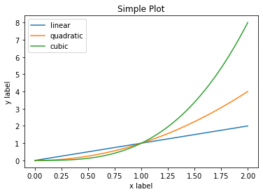
Another example on labels, title and legend.
import numpy as np		      # import the NumPy module
import matplotlib.pyplot as plt       # import the MatPlotLib module
x = np.linspace(0, 2, 100)            # Sample x data.
plt.plot(x, x, label='linear')        # Plot some data on the (implicit) axes
plt.plot(x, x**2, label='quadratic')  # etc.
plt.plot(x, x**3, label='cubic')
plt.xlabel('x label')		      # xlabel(string) takes a string argument that specifies the label for the graph's x-axis
plt.ylabel('y label')                 # ylabel(string) takes a string argument that specifies the label for the graph's y-axis
plt.title(" Simple Plot")             # Create title for the plot
plt.legend()	                      # legend() makes a legend for the data plotted.
plt.show()			      # display the plot in a figure window using the show function
If you do not specify the colour of the diagrams, default colours are given to distinguish each plot.
https://matplotlib.org/stable/tutorials/introductory/usage.html
For detailed labels, specifying line, symbols types and colours, check the following links
https://physics.nyu.edu/pine/pymanual/html/chap5/chap5_plot.html#fig-zigzagplotdemo
https://www.w3schools.com/python/matplotlib_labels.asp
Working with multiple figures
import matplotlib.pyplot as plt
X_names = ['A', 'B', 'C']
Y_values = [30, 60, 10]
plt.figure(figsize=(20,9))
plt.subplot(131)
plt.scatter(X_names, Y_values, s=200, c='r')
plt.subplot(132)
plt.bar(X_names, Y_values)
plt.subplot(133)
plt.plot(X_names, Y_values, c='g')
plt.suptitle('Three types of Plot')
plt.show()
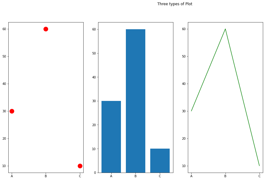
This program generates a 1-row and 3-column grid of plot using the subplot() function. With subplots() function you can draw multiple plots in one figure.
plt.subplot(131) means the figure has 1 row, 3 columns, and this plot is the first plot.
You can draw different type of plot, such as Scatter, Bars, Histograms and etc. For different sizes, colour of dots, lines, or bars, see the following links.
https://www.w3schools.com/python/matplotlib_subplots.asp
https://problemsolvingwithpython.com/06-Plotting-with-Matplotlib/06.12-Subplots/
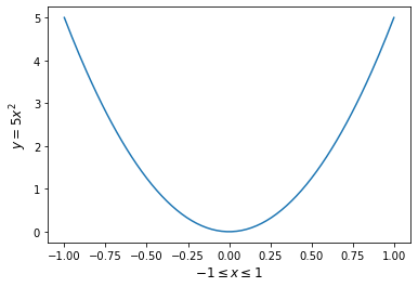
Lab Assignment
1. Write fig1.py to plot the function y = 5x² for -1 ≤ x ≤ 1 as a continuous line.
Include enough points so that the curve you plot appears smooth. Label the axes x and y.
If output window is not displayed in replit, click on Tools->Output
Sample output:
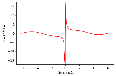
2. Write fig2.py to plot the functions y = sinx + 1/x in colour red with x going from -2π to 2π.
Include enough points so that the curve appears smooth.
Draw one horizontal gray line at y = 0 and the vertical gray line at x = 0.
Both lines should appear behind the function. Label the axes x and y.
Sample output: